
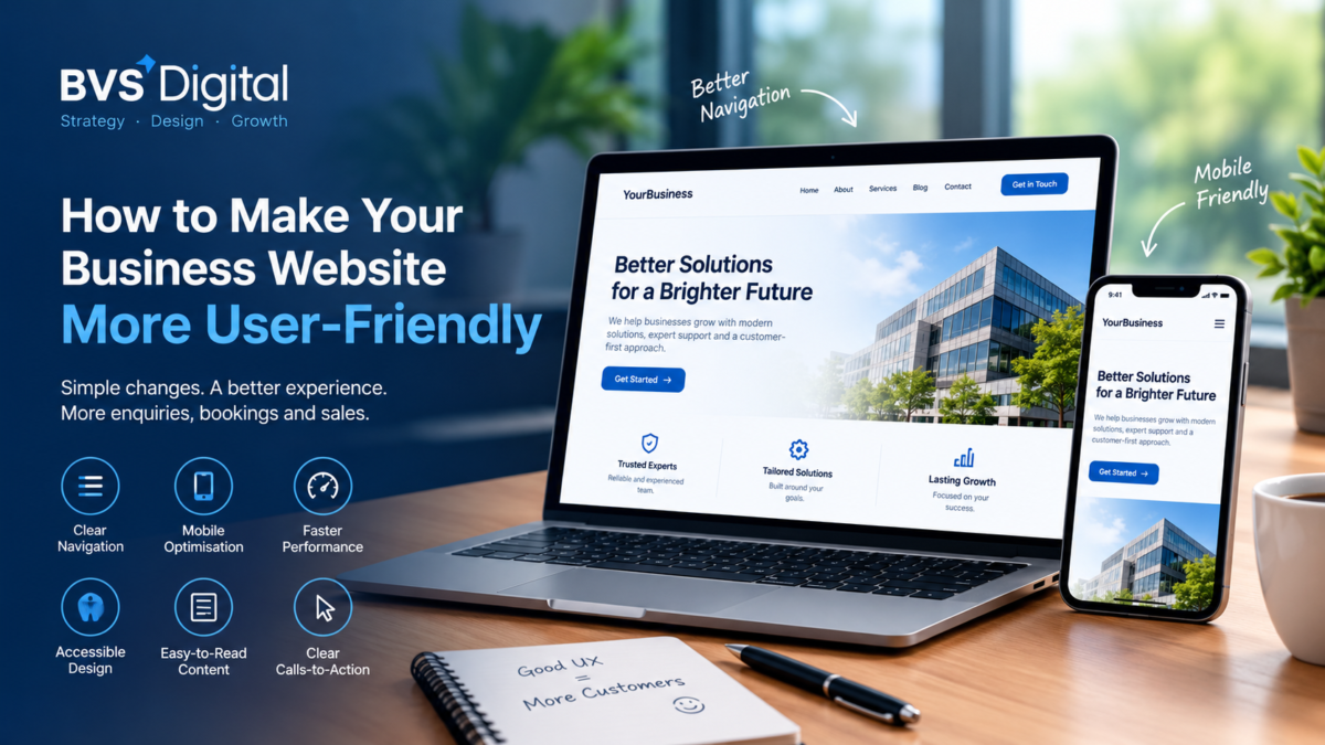
A user-friendly business website helps visitors understand what you offer, find relevant information and complete their next step without unnecessary difficulty. Clear navigation, readable content, fast performance and accessible design can increase customer confidence while supporting more enquiries, bookings and online sales.
These improvements matter to businesses throughout the UK. A law firm in London, a dental clinic in Birmingham, a retailer in Manchester and a hotel in Glasgow may serve different customers, but each needs a website that makes important actions simple.
| Quick answer: To make your business website more user-friendly, simplify its navigation, improve mobile usability, write clear content, increase page speed, and make calls-to-action easy to identify. You should also reduce form friction, improve accessibility, and test important customer journeys regularly. Every decision should help visitors find information and act with greater confidence. |
What Is a User-Friendly Business Website?
A user-friendly website allows people to complete their intended tasks efficiently. Visitors should not need prior knowledge of your organisation, its terminology or the structure of its services.
Usability covers more than visual design. It includes navigation, content, accessibility, performance, mobile layouts, forms and technical reliability. A visually attractive website can still provide a poor experience if visitors cannot understand the offer or find the contact page.
A user-friendly business website should help customers:
- Understand what the business offers
- Find relevant products, services or locations
- Compare available options
- Evaluate the company’s credibility
- Request information or a quotation
- Book an appointment or make a purchase
- Access support after becoming a customer
The website should also work for people using different devices, browsers, connection speeds and assistive technologies.
Why Website Usability Matters for UK Businesses
Your website may be the first detailed interaction a potential customer has with your company. If the experience is confusing, slow or frustrating, that person may return to the search results and choose a competitor.
Poor usability can reduce the return generated by SEO, Google Ads, social media and email marketing. These channels may attract suitable prospects, but the website must help them progress towards a commercial action.
Improved usability can support:
- More qualified enquiries and appointment bookings
- Higher online sales and completed checkouts
- Better engagement with important content
- Fewer avoidable customer-service questions
- Stronger trust in the business and brand
- More efficient paid advertising journeys
- Improved mobile customer experiences
Google recommends considering page experience holistically. Its page experience guidance explains that helpful content and good user experiences can contribute to search success, although usability alone does not guarantee higher rankings.
How to Create a User-Friendly Business Website
1. Build Navigation Around Customer Needs
Website navigation should reflect how customers search for information. Avoid structuring the main menu solely around internal departments or technical terminology.
A new visitor should quickly understand what the business offers, whether it is relevant and what they should do next. Use clear menu labels and keep primary navigation focused.
Breadcrumbs can help users understand where they are within an e-commerce store, knowledge centre or service hierarchy.
2. Make the Website Easy to Use on Mobile Devices
A user-friendly business website must work effectively on smartphones, tablets and desktop computers. Responsive design should adapt content and controls rather than simply shrinking the desktop layout.
Mobile visitors should be able to read text, use menus, select buttons, complete forms, view images and access contact options without zooming or horizontal scrolling.
Mobile usability is particularly important for local businesses. Someone searching for an emergency plumber in Leeds, a restaurant in Liverpool, or a dental clinic in Bristol may want to act immediately.
Google uses the mobile version of website content for indexing and ranking. Its mobile-first indexing guidance recommends equivalent primary content and structured data across mobile and desktop versions.
3. Use Clear and Readable Content
Visitors usually scan a web page before deciding whether to read it in detail. Long blocks of text, vague headings and complicated language make that process difficult.
Use descriptive headings, short paragraphs, plain English and helpful lists. Explain technical terminology and position essential information near the top of the page.
Service pages should explain the problem, audience, scope and next step. Product pages should provide accurate specifications, availability, delivery details and purchasing information.
4. Improve Page Loading Speed
Visitors should not need to wait while large images, videos or unnecessary scripts load. Slow performance creates friction before the customer has interacted meaningfully with the website.
Resize images, use efficient formats, remove unnecessary plugins, improve hosting, configure caching and reduce third-party scripts.
Assess service pages, landing pages, product categories and checkout stages. Google’s Core Web Vitals can help identify loading, responsiveness and visual-stability issues.
5. Make Calls-to-Action Clear
Every commercially important page should provide a logical next step, such as requesting a quotation, arranging a consultation, purchasing a product or booking an appointment.
Calls-to-action should use specific language, stand out visually, work on mobile and match the purpose of the page.
Avoid several competing buttons. Too many choices can create uncertainty and reduce the visibility of the most important action.
6. Simplify Contact and Enquiry Forms
Forms often create the final barrier between interest and conversion. Asking for unnecessary information can discourage prospects, particularly on mobile devices.
Request only the details required to respond. Use clear labels, helpful error messages, confirmation of success, and an explanation of how the business will respond.
Match the form to the operational need. A legal enquiry may need more context than a restaurant booking.
7. Design for Accessibility
Accessible design helps more people use your website, including visitors with visual, hearing, motor or cognitive impairments.
Maintain colour contrast, add meaningful alternative text, support keyboard navigation, caption important videos, structure headings correctly and allow text enlargement.
Accessibility can also improve the experience for people with temporary injuries, bright sunlight or slow connections.
The GOV.UK explanation of WCAG describes internationally recognised recommendations for improving web accessibility.
8. Create a Consistent Visual Experience
Consistency makes a website easier to learn. Buttons, headings, forms and navigation elements should behave predictably across pages.
Create standards for colours, typography, headings, buttons, forms, images, spacing and responsive behaviour.
Consistency also strengthens brand recognition across advertising, social media and customer communications.
9. Provide Evidence That Builds Trust
Visitors need confidence before contacting your business or providing payment information. Trust signals should be accurate, relevant and verifiable.
Useful evidence may include reviews, professional memberships, team qualifications, clear contact details, policies, secure payment information and photographs of real work.
Avoid unsubstantiated claims. Specific explanations of expertise, processes and service standards provide stronger credibility.
10. Make Website Search Useful
Internal search can improve usability on websites containing many products, articles, vacancies or locations.
Results should recognise common wording, spelling variations and relevant filters. Review what visitors search for and whether suitable results appear.
Repeated searches may identify information that deserves a more visible position in the main navigation.
11. Remove Intrusive Distractions
Pop-ups, autoplay media, and repeated notifications can obstruct content and interrupt the customer journey.
Avoid displaying several requests simultaneously. Visitors should be able to close optional messages easily and continue using the page.
Promotional content must not make important information difficult to access, particularly on smaller screens.
12. Test the Website with Real Users
Internal teams often understand the website too well to recognise usability problems. Customers approach it without that background knowledge.
Ask representative users to find a service, locate a branch, request a quotation, compare products or complete a purchase.
Observe where they hesitate, select the wrong option or abandon the task. Avoid explaining the interface during the test.
User-Friendly Website Improvements Compared
| Website area | Common problem | Recommended improvement | Commercial benefit |
| Navigation | Customers cannot find important pages | Clear labels and customer-focused structure | More visitors reach relevant offers |
| Mobile experience | Small text and difficult buttons | Responsive layouts and mobile controls | Fewer mobile users abandon |
| Content | Long, complicated or vague copy | Descriptive headings and plain English | Customers understand the offer |
| Forms | Too many fields and unclear errors | Essential fields and useful feedback | More completed enquiries |
| Performance | Pages load or respond slowly | Optimise images, code and hosting | Better engagement and efficiency |
| Accessibility | Content excludes some visitors | Accessible design and content practices | A wider audience can use the site |
How to Measure Website User Experience
A user-friendly business website should be evaluated using both quantitative and qualitative evidence. No single metric can explain the complete experience.
- Conversion rates for forms, bookings and purchases
- Completion rates for important customer journeys
- Form errors and checkout abandonment
- Engagement with key page content
- Internal search terms and unsuccessful searches
- Performance differences between mobile and desktop
- Customer-service questions caused by unclear information
- Feedback from user testing and customer interviews
- Core Web Vitals and page performance
High exit rates are not always evidence of poor usability. Someone may leave after finding a phone number or receiving a complete answer. Metrics must be interpreted in relation to each page’s purpose.
Common Website Usability Mistakes
- Designing around internal preferences instead of customer needs
- Using vague or creative navigation labels
- Providing several competing calls-to-action
- Hiding essential information behind unnecessary interactions
- Testing only on desktop computers
- Requesting too much information through forms
- Using stock imagery without useful context
- Installing features that reduce speed or accessibility
- Making major changes without measuring the outcome
Avoid changing multiple elements simultaneously when the objective is to understand what improved performance. Prioritised testing provides clearer evidence and reduces implementation risk.
When Does Usability Require a Complete Website Redesign?
Not every problem requires a new website. Content updates, navigation changes or performance improvements may resolve isolated issues. A complete redesign may be appropriate when:
- The platform prevents responsive or accessible improvements
- The navigation and page structure require extensive changes
- The design no longer reflects the brand or target audience
- The website is difficult to update or maintain securely
- Several important customer journeys perform poorly
- New integrations or e-commerce functions are required
- Technical limitations affect SEO and page performance
A structured audit should determine whether optimisation or redevelopment offers the stronger return. BVS Digital’s guide to website design and development in the UK explains the strategic and technical considerations involved.
How BVS Digital Improves Website Usability
BVS Digital connects user experience improvements with measurable business objectives. The work considers how content, design, development, SEO and conversion performance affect the complete customer journey.
- Website and customer journey reviews
- Navigation and information architecture planning
- Mobile and responsive design improvements
- Content structure and messaging recommendations
- Form and call-to-action optimisation
- Accessibility and performance reviews
- Analytics and conversion measurement
- User testing and ongoing optimisation
BVS Digital’s conversion rate optimisation services help identify friction and improve valuable actions. Where the platform limits improvement, its web design and development services can create a stronger foundation.
If customers struggle to navigate, understand or use your website, speak with BVS Digital about creating a more user-friendly business website. Contact the BVS Digital team to identify improvements that support enquiries, bookings and online sales.
Frequently Asked Questions
How do I know whether my website is user-friendly?
Ask representative users to complete important tasks without assistance. Review where they hesitate, make mistakes or abandon the journey. Combine these observations with mobile testing, conversion data, form errors, page performance, and customer feedback.
What makes a website easy to navigate?
An easy-to-navigate website uses clear menu labels, logical page groupings and consistent layouts. Important pages should not be buried unnecessarily. Visitors should understand where they are and what action they can take next.
Does a user-friendly website improve SEO?
Good usability can support SEO by improving mobile experiences, page performance, content structure and internal navigation. However, it does not replace relevant content, technical accessibility and authority.
How often should website usability be tested?
Test important journeys regularly and after significant changes to navigation, design, content, forms or integrations. Ongoing measurement helps identify problems before they reduce campaign or commercial performance.
Conclusion: Make Every Website Visit Easier
A user-friendly business website removes unnecessary effort from the customer journey. Visitors can understand the offer, find useful information, and complete important actions with greater confidence.
Start with navigation, mobile usability, content clarity, accessibility and performance. Then review forms, calls-to-action and trust signals using customer feedback and reliable conversion data.
BVS Digital helps businesses in London, Manchester, Birmingham, Leeds, Liverpool, Sheffield, Bristol, Glasgow and across the UK improve website experiences and commercial performance. Visit the BVS Digital website to explore its wider digital services.